Window Genie Price Estimator
Client: Neighborly
Role: UX/Product Designer
Date: March 2025
Client: Neighborly
Role: UX/Product Designer
Date: March 2025
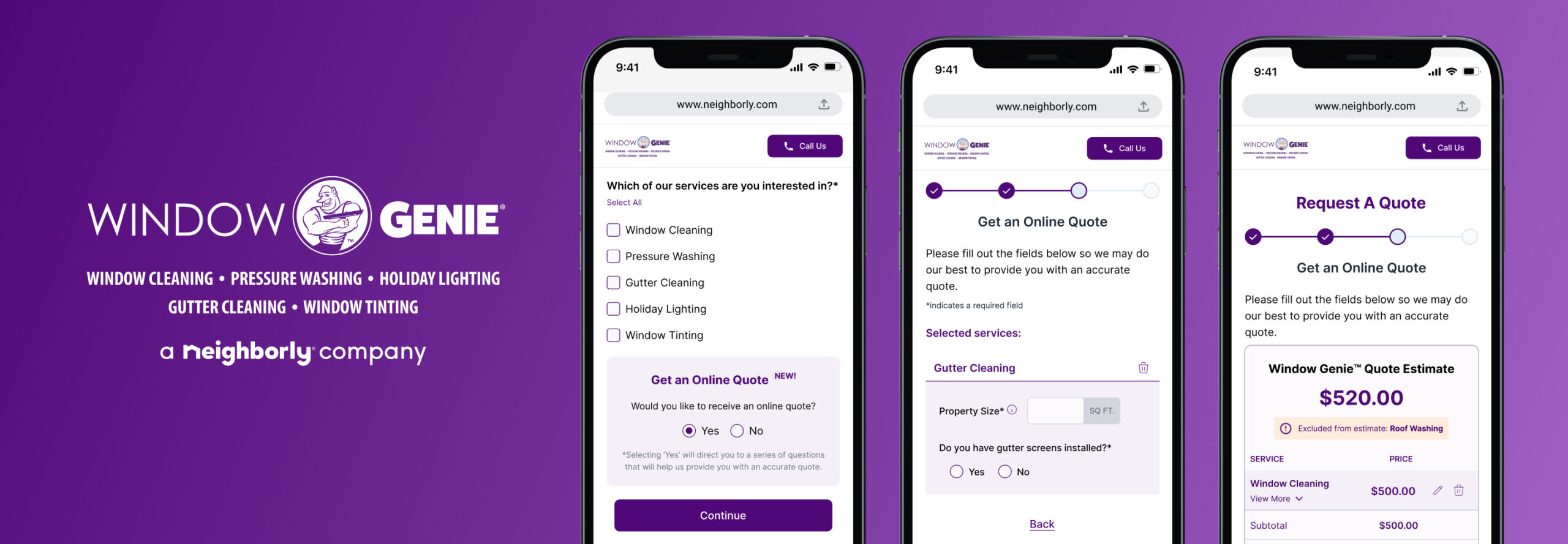
Problem: One of Neighborly’s brands, Window Genie, did not have a quick way to provide online pricing to new and returning customers.
How might we create a pricing tool that is easy to use and provides pricing information quickly?
Hypothesis: Integrating a price estimator into the lead flow will increase completion rates through enhancing customer engagement, and provide valuable lead information for franchise owners.
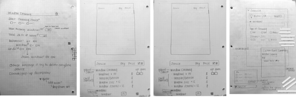
Wireframes
Early wireframes primarily consisted of lists and all the elements we would need to account for in the design phase. Because certain Window Genie services had yes/no logic, we had to carefully think about how this would translate into the UI and map out the full flow and all potential paths.
First Iteration
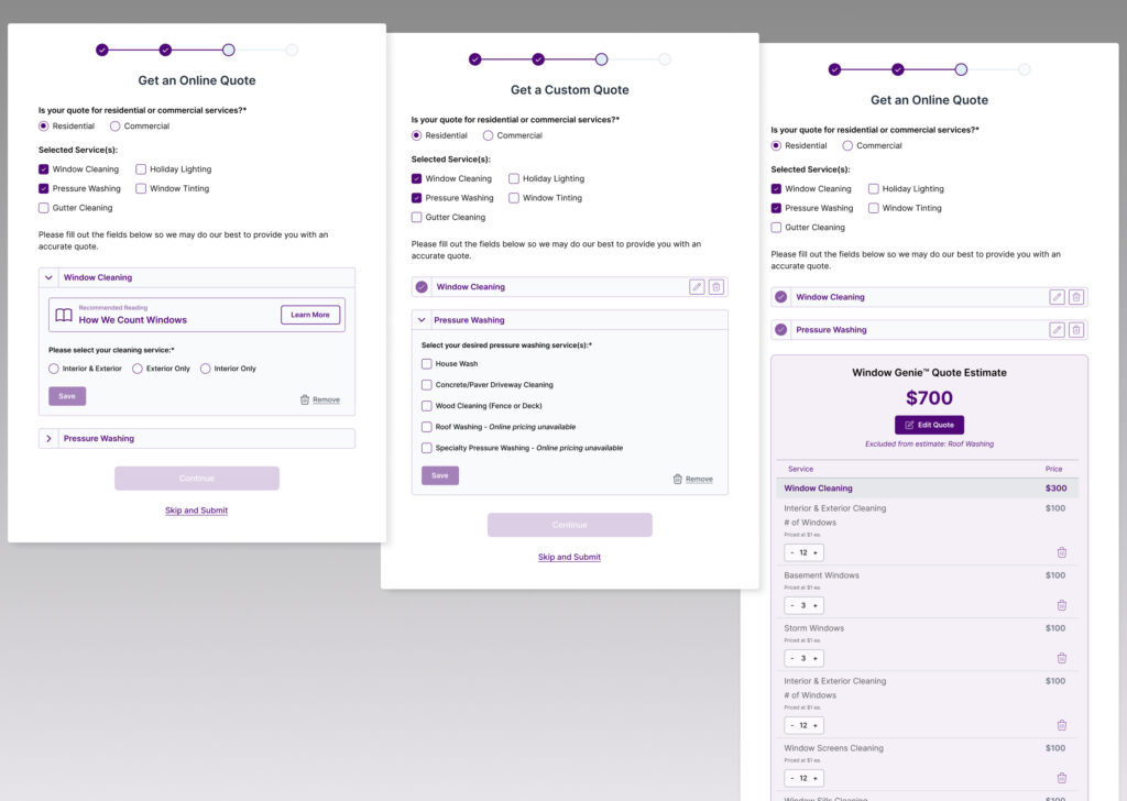
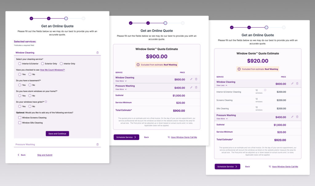
Our first round of designs included a solution where the services for which pricing is requested are displayed as accordions. Depending on how many services the customer wants pricing for, they will go through each accordion’s questions and once they finish those questions, the next accordion will automatically expand. The goal here is to simplify the user’s cognitive load and let the tool do the work for them in terms of getting from point A to point B.
Once the customer finishes their final accordion, a quote appears below with an itemized list of all the services and their respective pricing.
Feedback & Testing
Brand feedback
- The stakeholders liked the overall concept of services as accordions with the relevant information inside each one. However, there was a lot of back and forth around the user experience of the ‘Window Cleaning’ service specifically, since this was the most complex service accordion of all five.
- The stakeholders also wanted the quote summary the user receives at the end to be less interactive and more itemized. We made plans to revisit the UI/UX for this after testing so we could validate if these improvements should be made.
User Testing
For testing, we used a prototype where the user has selected two services: Window Cleaning and Pressure Washing.
Users expressed annoyance and frustration that the window cleaning accordion had too many questions. What we hypothesized would be a better experience having the questions displayed in a ‘progressive’ format ended up being a negative experience for users.
“I want to see all the questions up front so I know how much time I’m investing in this.”
Additionally, users felt like having the quote summary and the accordions on the same page was overwhelming.
“I feel overwhelmed and not sure what to focus on. It’s nice that I wouldn’t have to go back to a screen to edit my info, but I still have to scroll really far up and down to see everything.”
“The quote summary is clean, but I’d rather see the main services and if I want to see more, I can click for more info.”
Feedback from stakeholders and user testing told us that at the end of the day, users want to feel like they’re in control, and if they need more information, they want to see the option to obtain that, not necessarily all the information at once. We took these feedback points into our second iteration and aimed for a cleaner, more condensed user interface and experience.
Second Iteration
During this phase, we explored several ways to enhance the UI/UX based on stakeholder and user feedback.
We also identified several other areas where we could clean up the UI and in turn create a better experience:
We removed the service checkboxes from the quote tool screen as we concluded having it there was redundant, potentially confusing, and taking up valuable digital real estate when the quote tool should be the primary focus.
We tightened up the padding and eliminated borders around the accordions. We also provided the user with the option to remove an accordion on the accordion itself, versus within the accordion content.
For window cleaning specifically, we have all the primary questions displayed initially instead of the original progressive flow we designed.
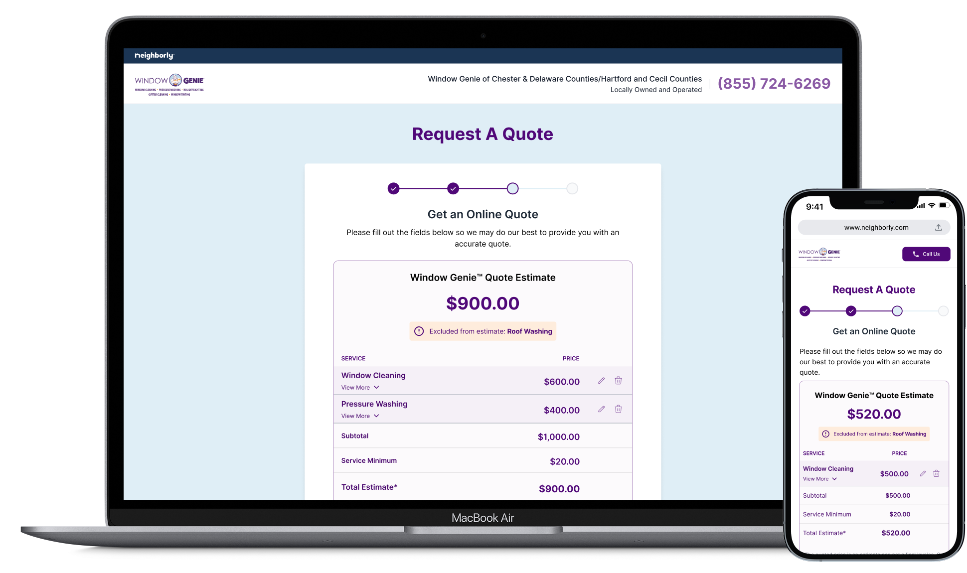
On the quote summary, we hid the accordions so as to emphasize the itemized quote. If a user wants to edit a service, the accordion will reappear. We also kept the services collapsed in the itemized quote and gave the user the option to view more details if they expand it.
Generally, we reevaluated the verbiage and CTA language at each step to ensure the actions performed by the user were clear and informative.
“I feel overwhelmed and not sure what to focus on. It’s nice that I wouldn’t have to go back to a screen to edit my info, but I still have to scroll really far up and down to see everything.”
“The quote summary is clean, but I’d rather see the main services and if I want to see more, I can click for more info.”
Feedback & Testing
Brand feedback
After working through our second iteration of the pricing tool, we presented to stakeholders our enhancements and received more positive feedback than on the first iteration. The stakeholders preferred the cleaner interface and efforts to condense information in intuitive ways.
User Testing
User testing was also all around more positive this round: While the first iteration seemed overwhelming for users, the second iteration — though possessing about the same amount of content and information — left users feeling confident in their decisions and actions while using the pricing tool.
“I like the yes/no questions - I don’t have to think too much about my answers and that helps me get a price faster.”
“I like that I can quickly delete a service if I change my mind about it. I don’t want to feel pressured to fill out something I don’t want anymore.”
“I like that I can get a quote or see pricing and I don’t have to schedule right away. I still have the information I need to make an informed decision.”
Final Thoughts
This project was challenging in that it presented many different use cases and conditions (if/then) that required me as a UXer to think through all the different ways in which the user might interact with the pricing tool.
It would have been nice to have more creative freedom with how we designed the pricing tool, but I understood that sometimes design and business goals have to compromise a little in order to align. We want to increase leads and customer engagement, and potentially adding more screens/steps may counteract that. If I were to redesign this again, I would’ve made it a separate tool from the lead flow, added more animations and imagery for visual appeal, and simplified the questions as well as broken them into steps to make the experience a bit more digestible and less visually overwhelming.
This pricing tool is in the MVP of development right now, but several enhancements are being worked through for future MVP, such as:
- Allowing the customer to add/re-add services on the same screen as the pricing tool
- Testing the pricing tool as part of the lead flow against being a separate tool all together on the Window Genie website
I enjoyed working closely with stakeholders and developers on this project and strengthen the relationships between UX, Product, and Development teams.