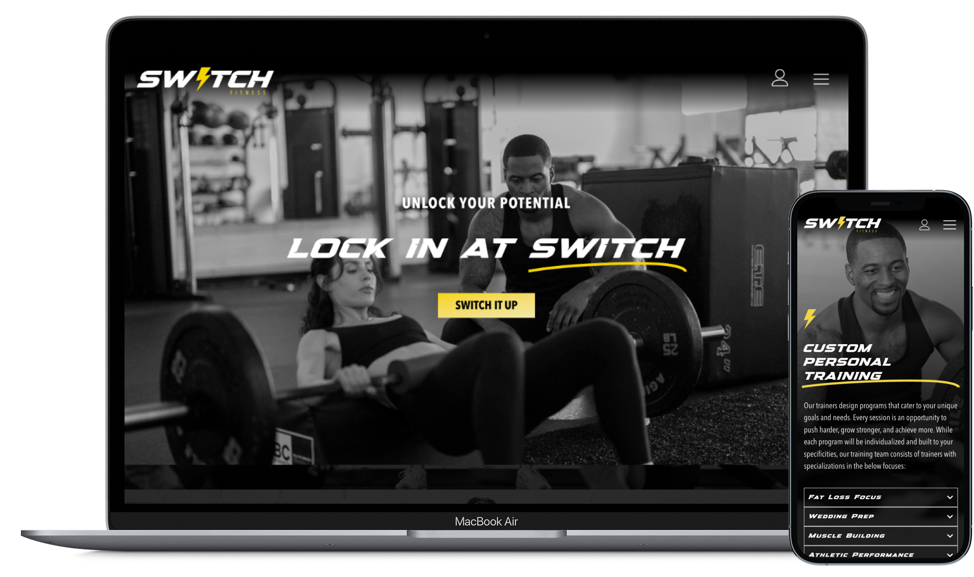
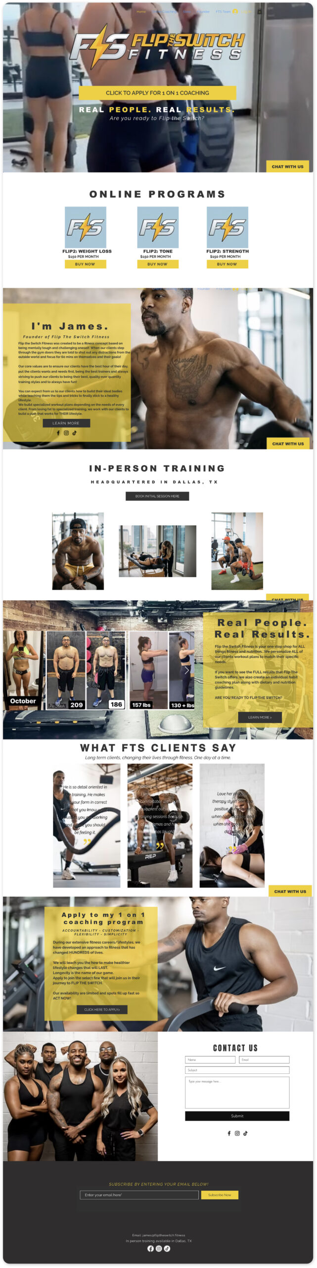
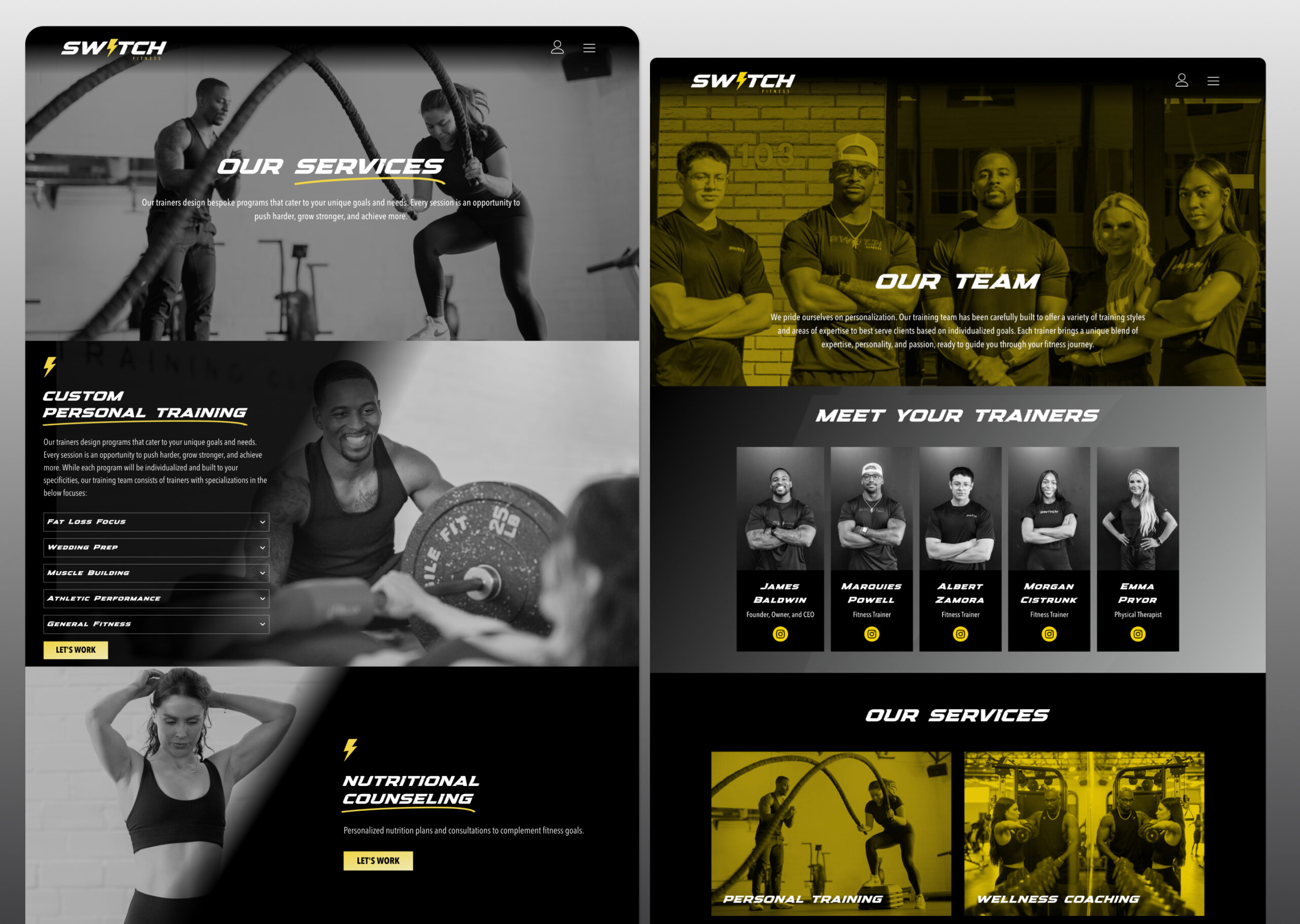
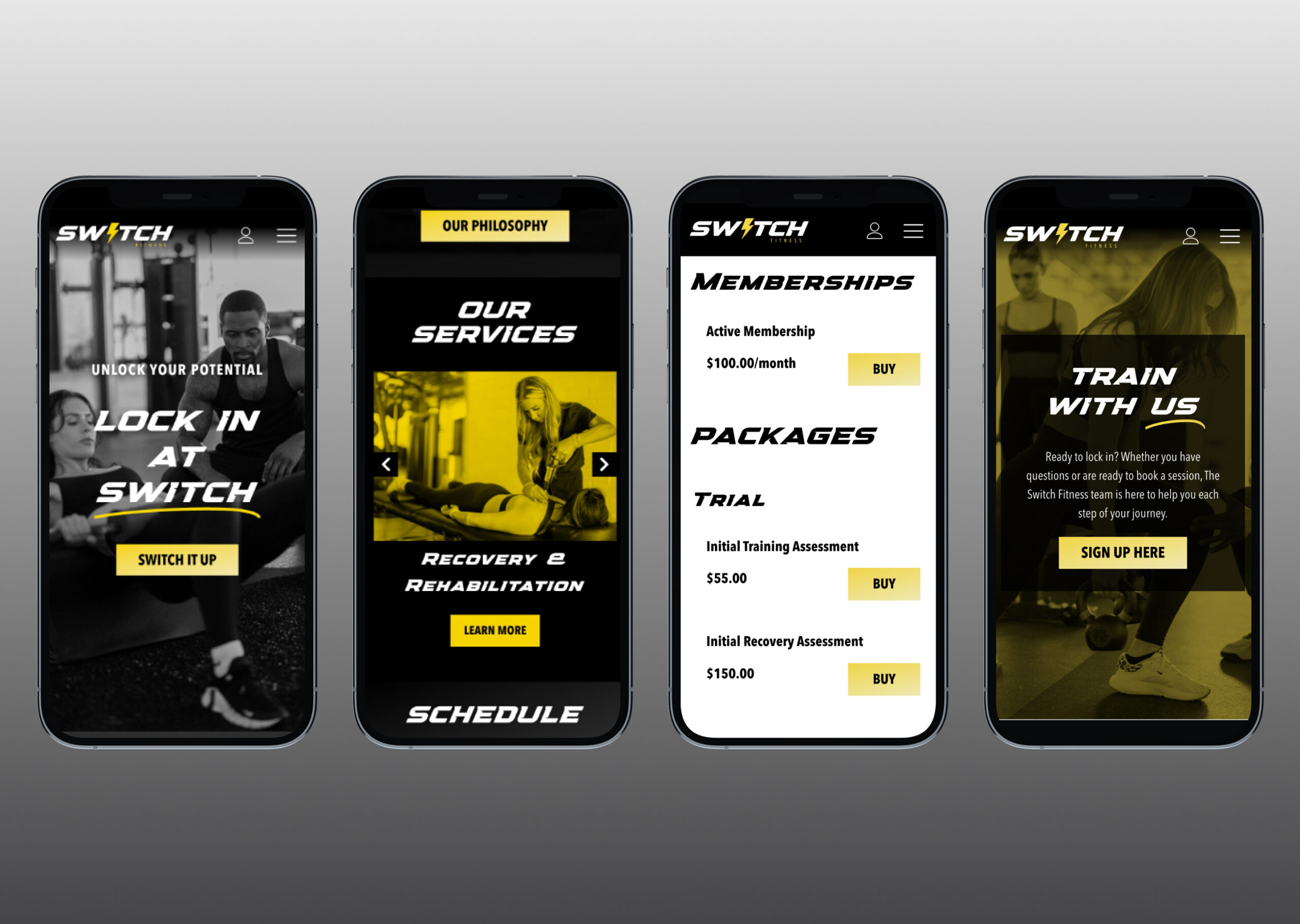
The predating Switch Fit website (previously under the name ‘Flip the Switch Fitness’ was too content heavy and needed a redesign that emphasized the high-end fitness and nutrition services the company provides. I collaborated with Switch Fit’s Founder and marketing team to redesign their website and give it the luxe look and feel of a high-demand fitness trainer and facility.
Redesign Goals:
Optimized responsive design for mobile
Allowing the user to easily and quickly switch between studios
Centralizing the Jungle brand so its customers can access information in one spot
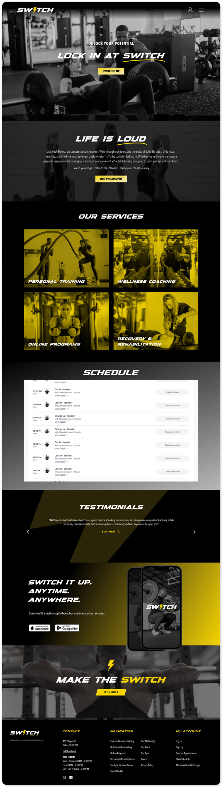
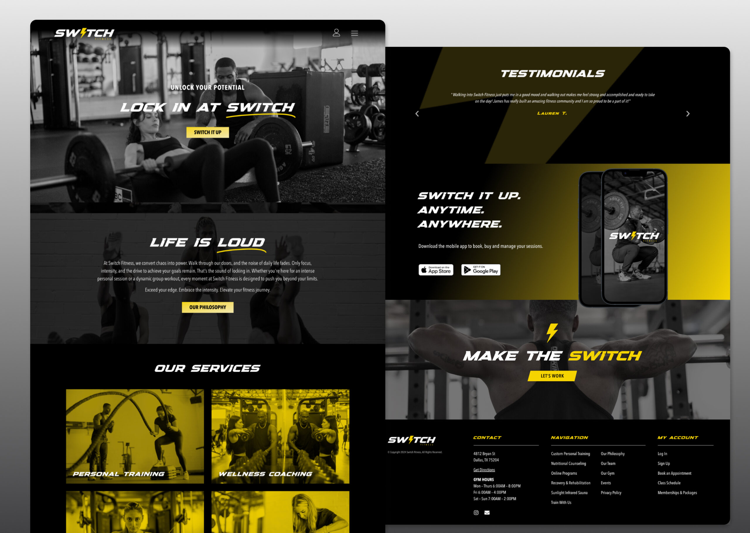
Redesign
Original
Enhancements:
• I used Switch Fit’s updated branding to really drive the design of the website. To keep the user’s focus on the content and less distracted by different images and offerings, I limited the site colors to black, white, and the electric yellow color as an accent. I also used duo-tone filters on some of the imagery to achieve a sleek and serious effect.
• I simplified the navigation to an account icon and hamburger menu icon to eliminate clutter and condense the sitemap. I also included the navigation in the footer so users still have rather quick access to other pages. The header is also sticky on desktop and mobile.
• I used subtle fade and zoom animations throughout the site to give it a more luxe feel and draw in the user’s attention; additionally, I added text animations to emphasize key words to achieve the client’s desire for an “electric” feel, as resembled in their brand logo, the lightning bolt.