Volo Loans
RESPONSIVE WEB DESIGN
Volo Loans is a lending company specializing in helping expatriates purchase or refinance international property – specifically, in Costa Rica.
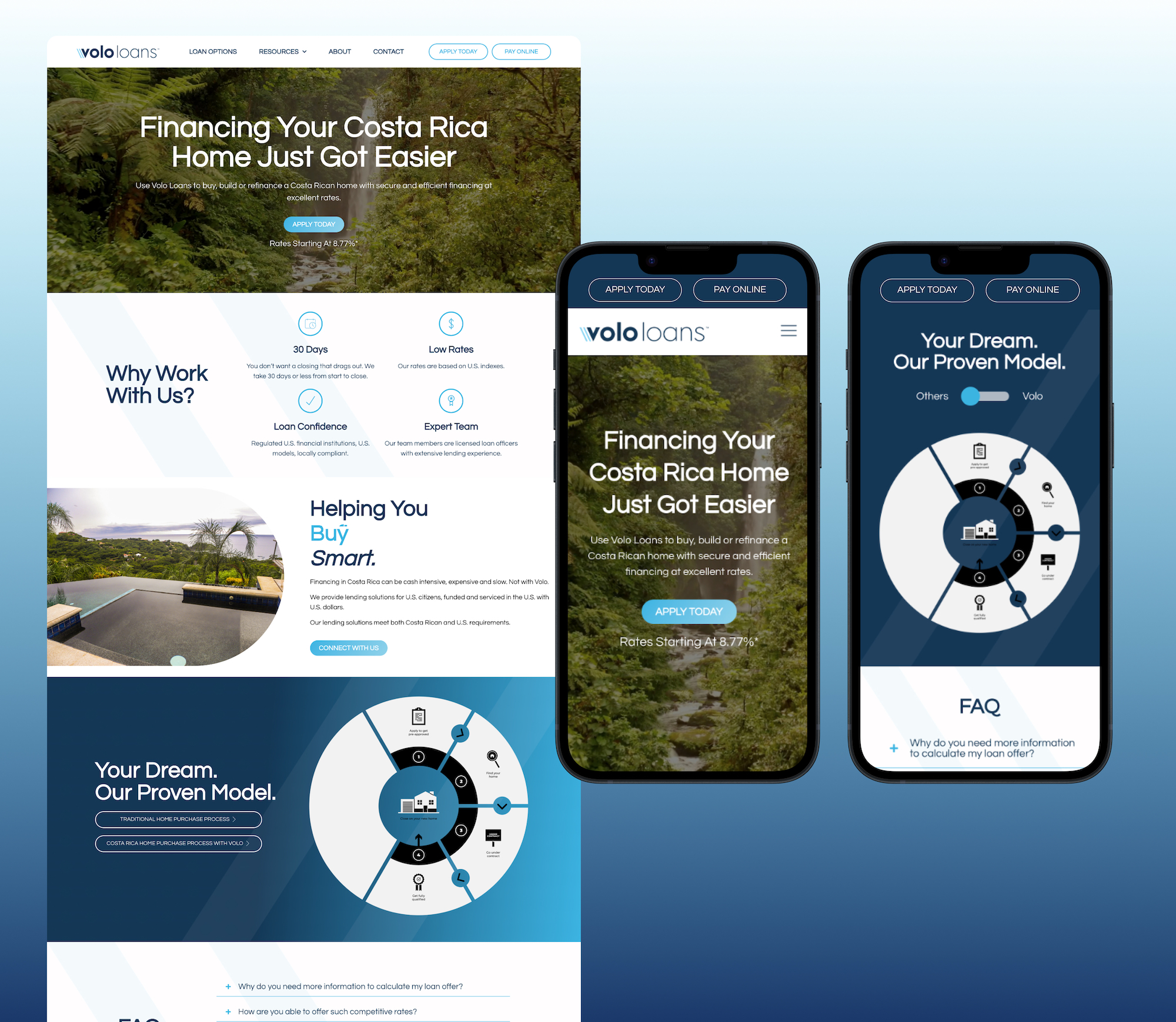
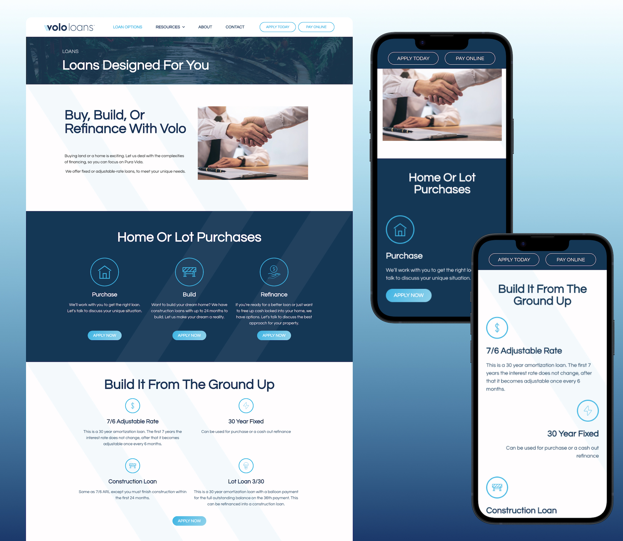
For their website, the client wanted the blues from their branding incorporated into a clean, straightforward layout. I used the “slashes” in the “V” in their logo as a background element throughout the site to give sections movement without looking too busy.
The biggest challenge of this project was figuring out how to contrast the traditional loan process with that of Volo’s. After searching through all accessible widget libraries, I found a string of code that allowed me to achieve this effect seamlessly. On desktop, you click the button to switch between the two graphics, and on mobile the buttons become a single toggle, making the mobile experience easier and more intuitive for the user.
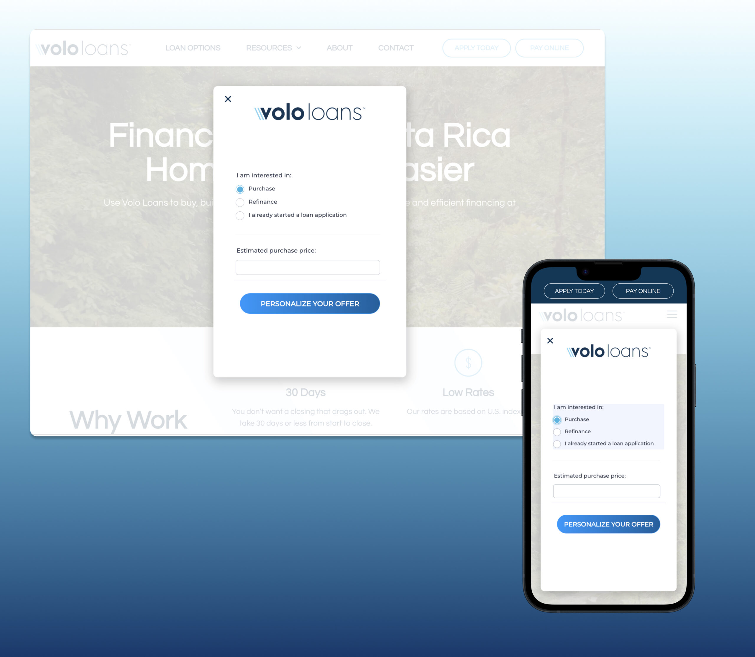
Another aspect of this site that was a first for me was designing a complex form for users to complete. I worked with the Volo team to implement the form as an interactive popup with conditional logic. This was another win for Volo and for myself as a web designer as I acquired more experience with designing complex forms, applying conditional logic, and figuring out how to implement them for a seamless application experience on the website.


