The Stena Foundation is an organization seeking to promote financial inclusion and equal access to education. I worked closely with the Marketing Director on redesigning their existing website, which needed more dynamic layouts and content and consistent styling elements.
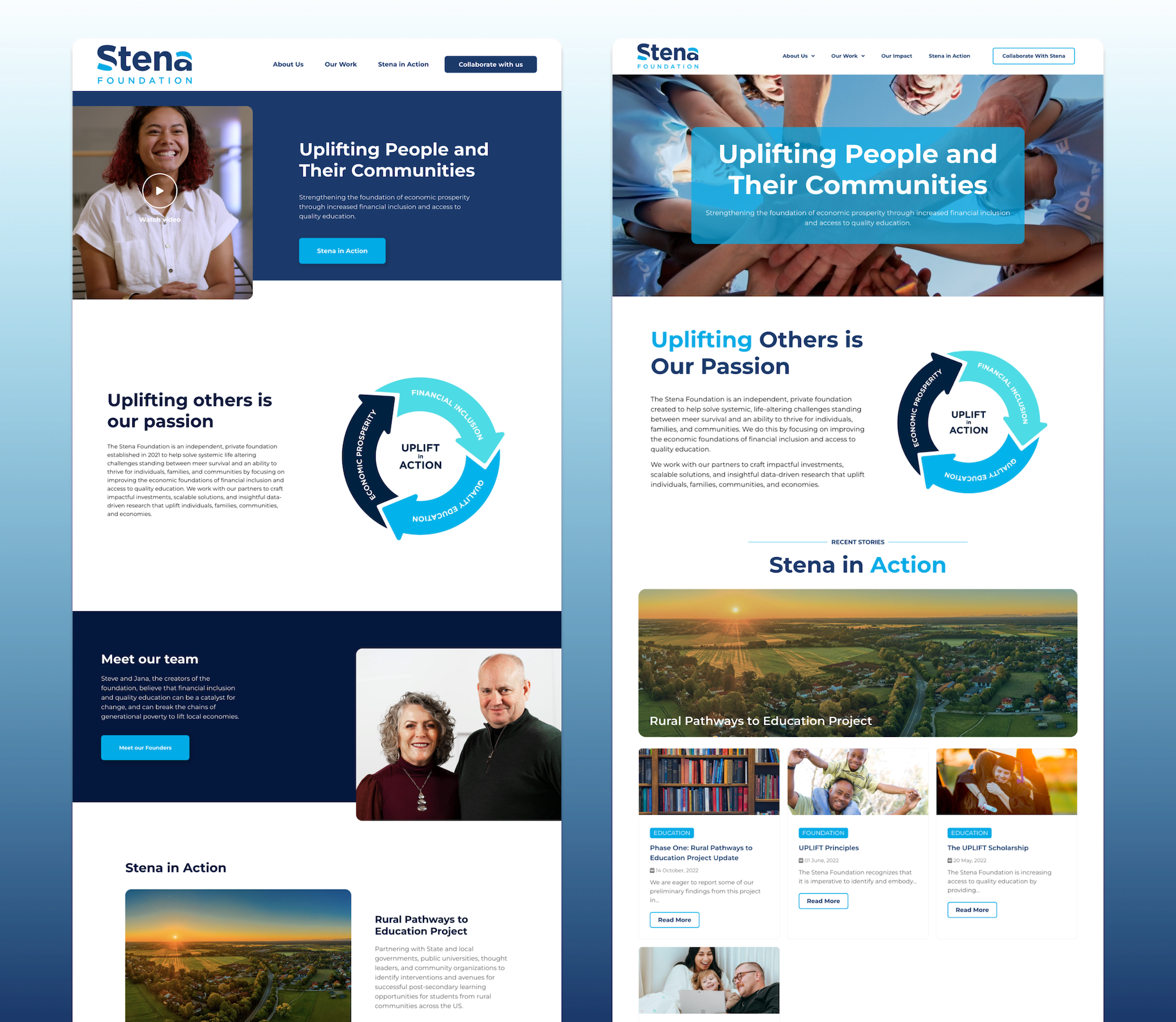
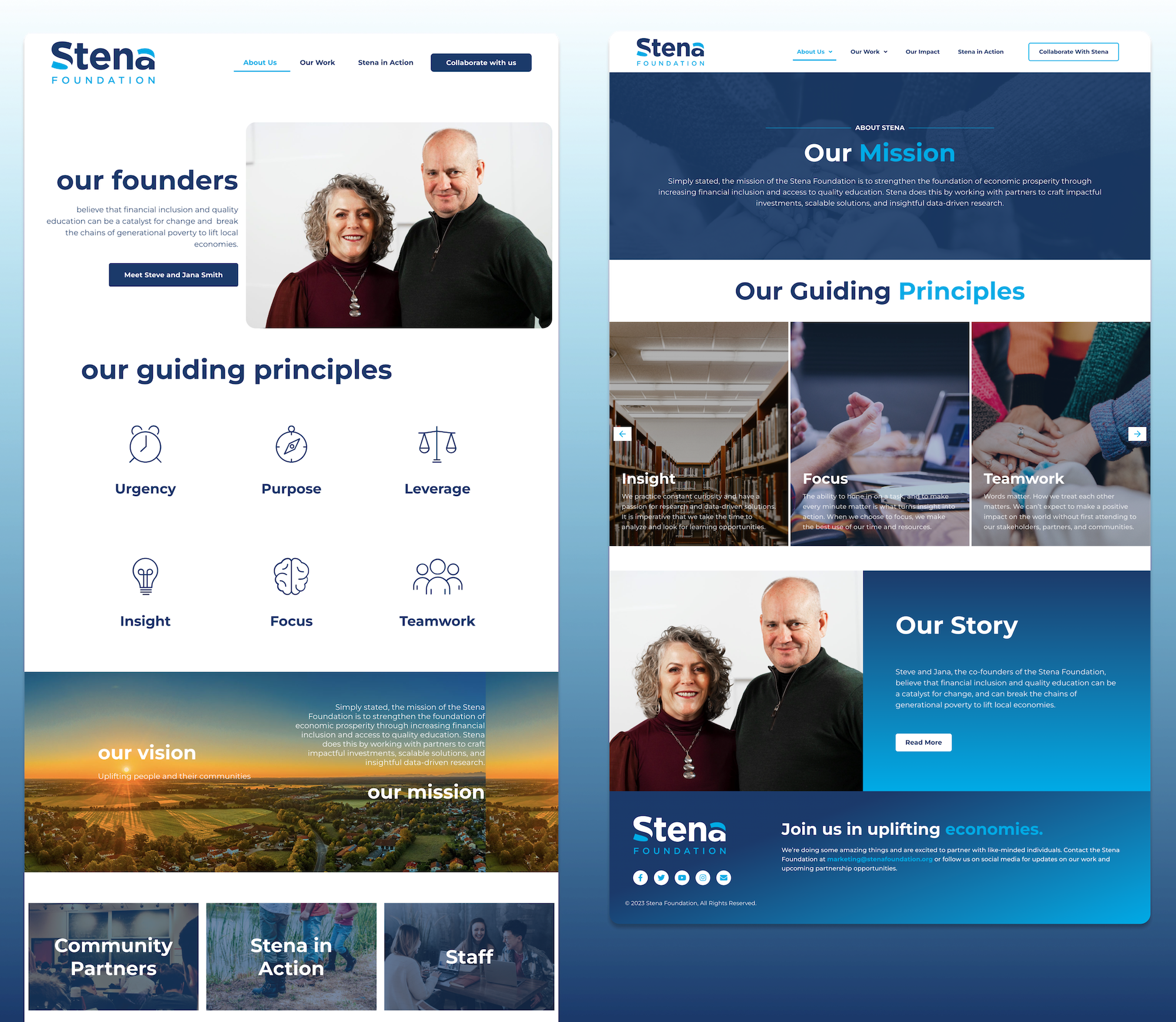
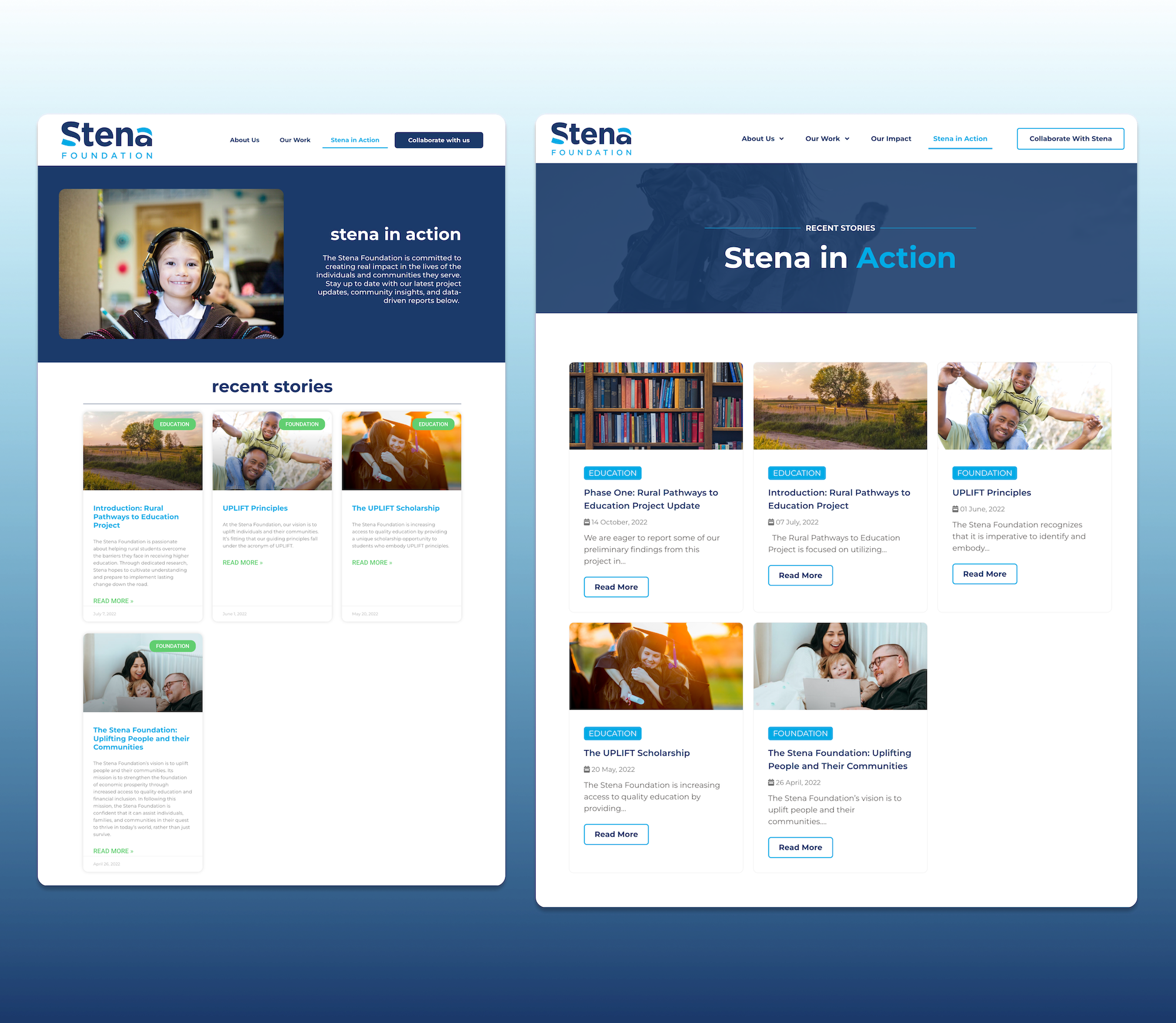
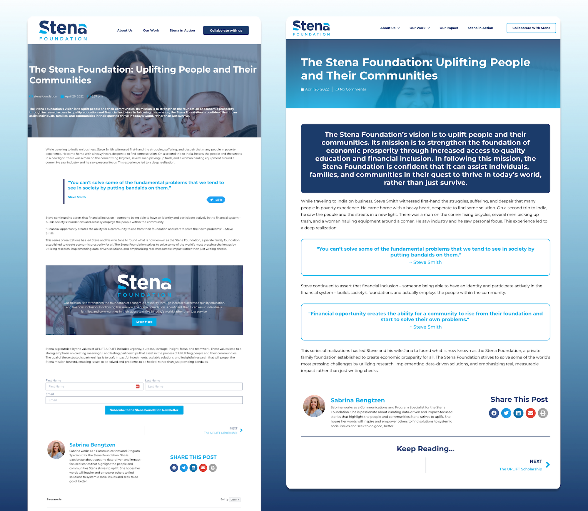
The previous Stena Foundation site’s styling was inconsistent and detracted from the foundation appearing legitimate and professional.
A surplus of white space on most of the pages gave the website an overly simplistic look and didn’t engage the user much.
The site’s content was quite static and plain, and didn’t accurately capture the Stena Foundation’s values and goals. Additionally, the blog posts had no set stylings or templates to help create a consistent look across the board.
GOALS:
I used more images in the redesign to help break up the page and fill negative space.
I established a typography hierarchy to ensure font styles were fluid across the website, and created consistent header styles for the interior pages that let the user know where they landed without being the center of attention.
To clean up the blog, I implemented a blog post template so that all posts had consistent styles and formats. Finally, to make the site more engaging and dynamic, I added animation effects to the headlines and main graphics.
RESULTS:
When compared to the previous site, the new and improved Stena Foundation website looks cleaner and more professional overall.
The new layouts made content easier to digest and presented key values and ideas about the foundation in ways that allow the user to interact and easily navigate the site.