FiiZ Drinks
WEBSITE REDESIGN
SUMMARY:
FiiZ Drinks is a growing national soda shop chain with its original location in Bountiful, Utah. After years of having a website design that felt “flat” and sub-par user experience, our team felt a major makeover was necessary. I led this redesign and presented the final result to the President of Franchising and other members of the FiiZ team.
PAIN POINTS:
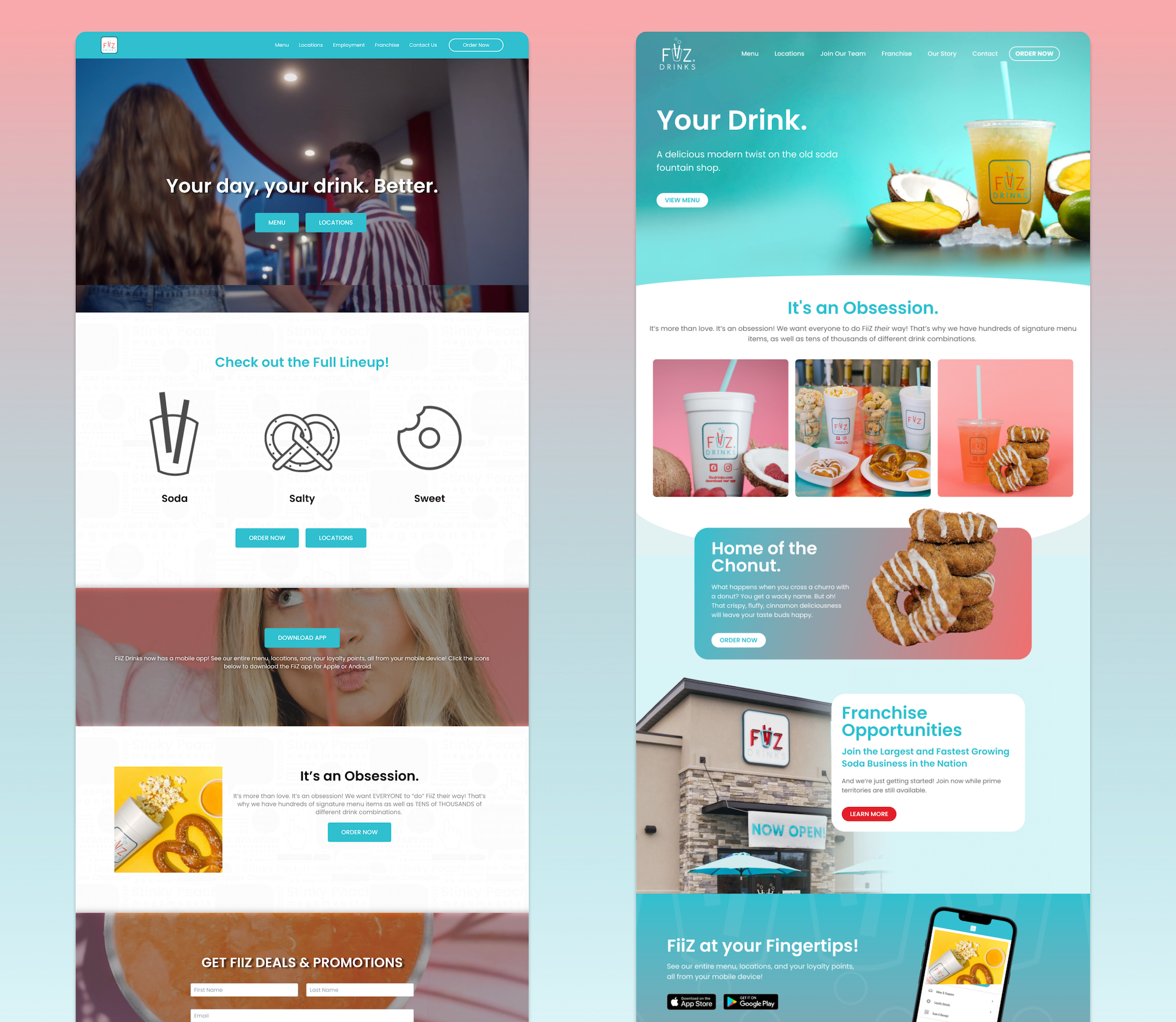
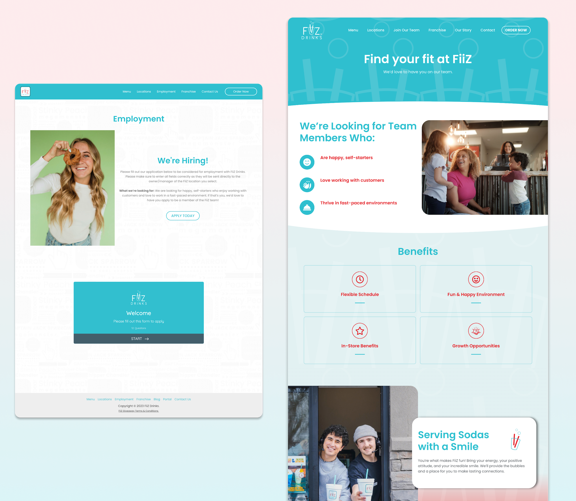
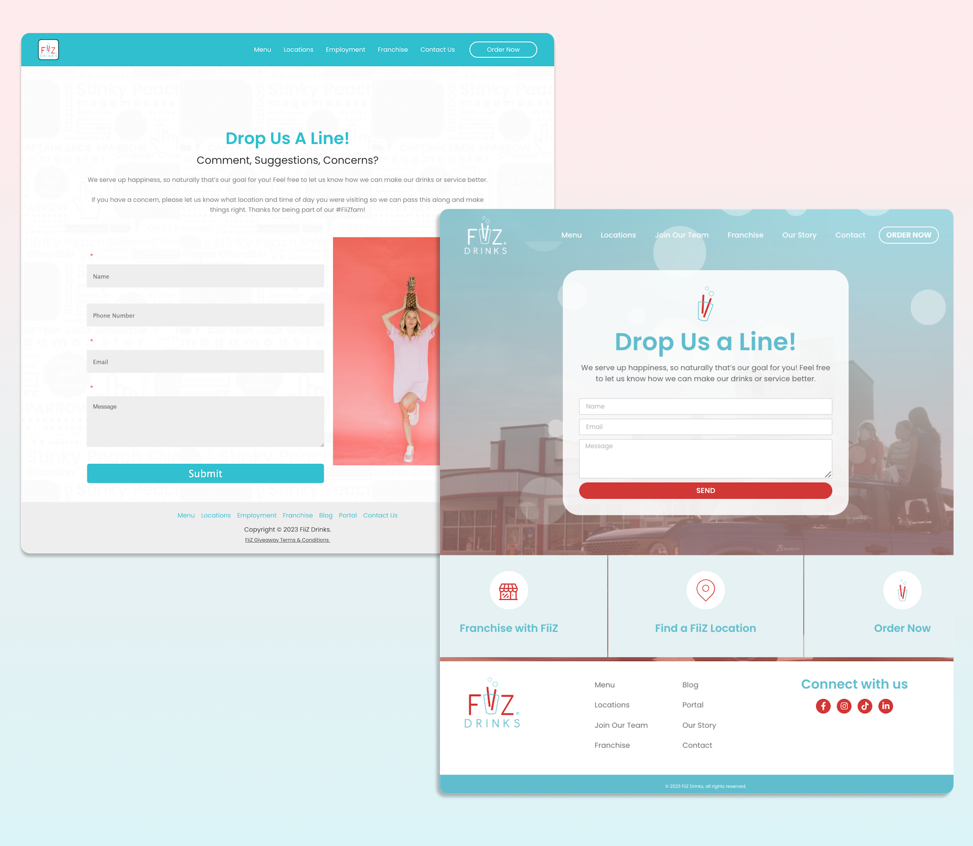
The previous FiiZ website lacked consistent font faces and sizing.
The experience for finding a location was tiresome and frustrating – how might we make it easier for users to find a FiiZ location near them?
Many of the site’s pages were just info dumpsters with no critical thinking to make the design engaging, leaving much to be desired for such a bubbly brand.
Finally, the website lacked updated imagery and iconography, which highlighted the need for new, fresh content.
GOALS:
My first and foremost goal was to make the site more engaging and dynamic. I did this by incorporating hover animations to various elements, and including bubbles that float throughout the page to achieve a “bubbly” feeling for FiiZ.
I redefined the site’s info architecture by reorganizing content to make room for an “About” or “Our Story” page. Originally, this content was on the ‘Franchise’ page, which felt out of place and made the scroll time on such an already info-heavy page even longer. Although it was one more page for users to navigate, it honored best practices for web design by giving a clear identity to the brand.
Finally, the biggest improvement on the site was designing and implementing the experience of a store locator. Originally, the ‘Locations’ page was an endless list of locations, which made finding one taxing for users, and updating or adding one tedious for the designer. I designed the locator and store cards with hover states in Figma, and worked with an application called Storepoint to code and implement the experience on the FiiZ website.
RESULTS:
Compared to the old website, the new FiiZ website is anything but flat. It’s bubbly, lively, colorful, and fun – and that’s exactly what a growing national brand should reflect in the physical and digital spaces.
The team provided positive feedback to the redesign andit was approved to go live.
Now, users can experience a new and improved FiiZ, and find a location quickly and easily.
REFLECTIONS:
Next steps on improving the site’s experience and interface will be navigating away from the menu experience in Crisp, and creating a menu on the backend of the website.
Another future iteration will be optimizing the contact forms o the site and redesigning the FiiZ mobile app.
BEFORE & AFTER