Cumulus Digital Sales Portal
RESPONSIVE WEB DESIGN
SUMMARY:
Cumulus Media’s sales reps submit orders through a password-protected sales portal, which includes information on 154+ markets and the latest guides and decks on digital products they need to close a sale.
PAIN POINTS:
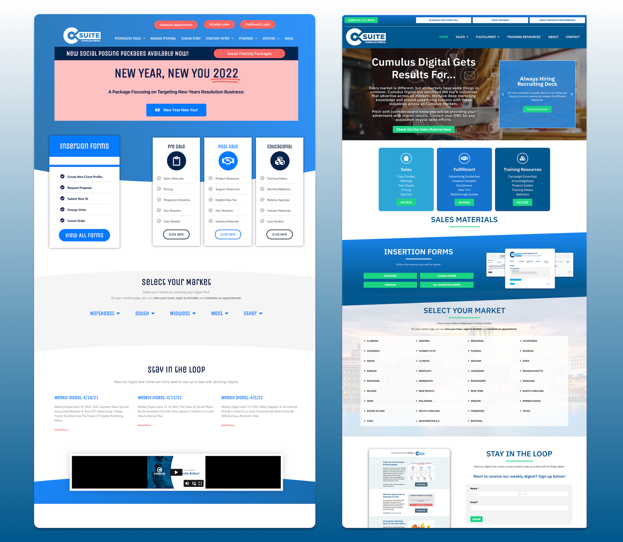
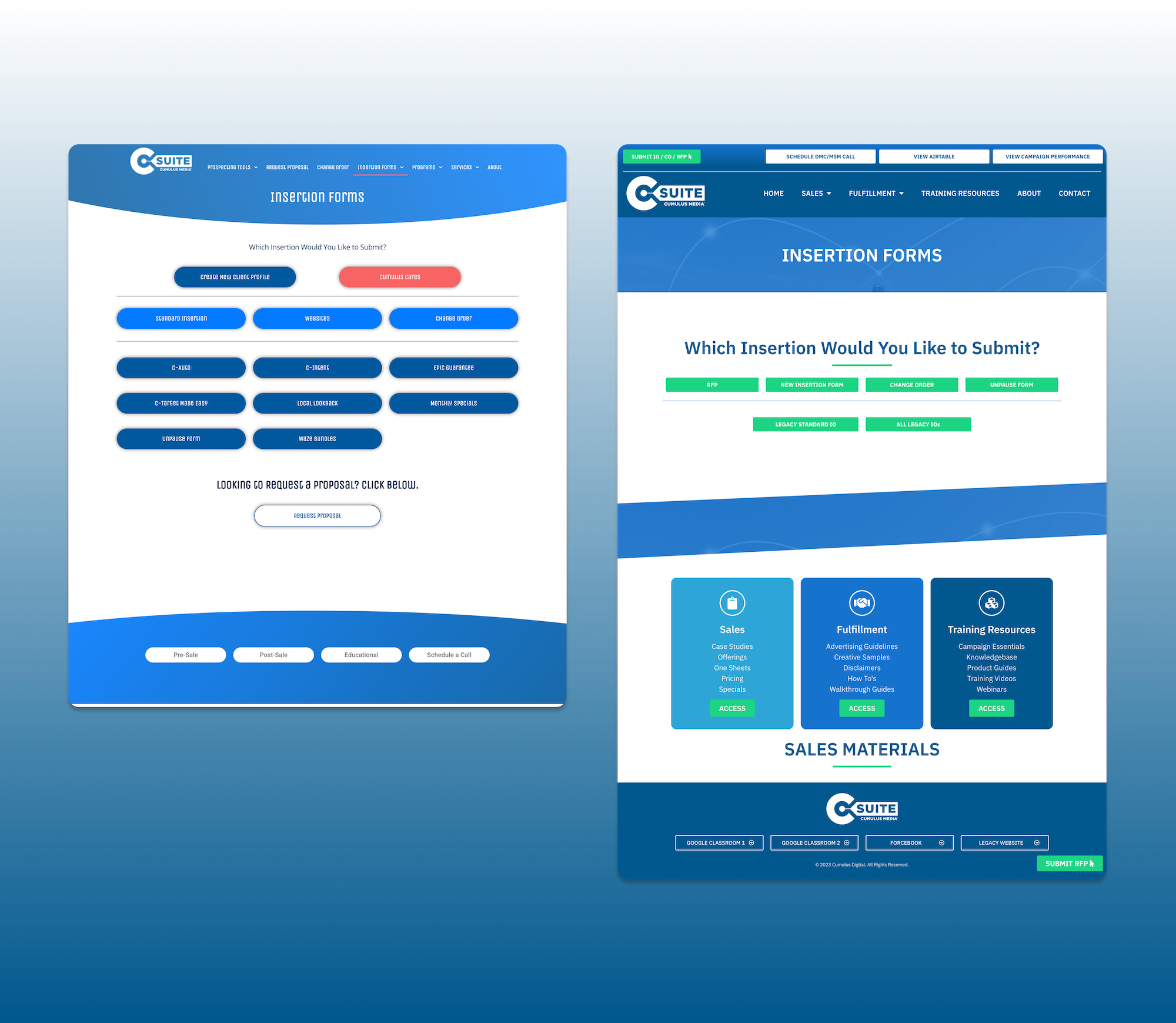
The previous portal lacked a responsive design and consistent navigation, which made the key tasks of 1) sales reps submitting insertion orders and 2) sales reps gathering materials to share with clients difficult and messy.
The site was a digital info-dumpster which also made content difficult to find and digest.
With 154+ markets, the only place to access all markets was on the homepage. Even then, the markets were organized by region, which increased time and thus frustration amongst sales reps looking for a specific market.
GOALS:
My main goal was to not only improve the site’s overall design, but also redefine the site’s user experience. I worked closely with our head of sales and company president to define several user flows on the site, and better understand the user’s journey through a sales rep’s perspective.
In the redesign, I restructured the navigation with less drop-downs in attempt to better synthesize content. I also included a sticky header with quick links; based on collaboration and research with the sales team, we pinpointed the highest visited pages and made those quick links so that no matter where a sales rep lands on the site, they will always have quick, easy access to the most important materials.
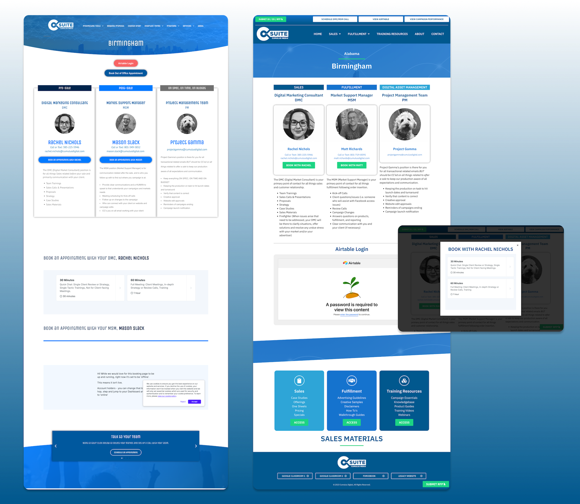
Additionally, I reorganized the markets to appear by state vs. region, eliminating extra guessing on the sales rep’s end. I also condensed each market’s page by incorporating the team members’ booking links as pop-ups. Originally, they were included on the page.
With so many active markets and their counterparts changing frequently, it was important to make the back-end experience seamless for me and the sales team as well. Using Elementor’s Global Widget function, I made each team member a global widget so if their number or email changed, or perhaps they were moving to a different market, we could update the widget and it would apply across the entire site.
RESULTS:
After several months of close collaboration with sales leadership Infinite Digital’s President, the new sales portal launched.
Sales reps across the board reported that they could now easily find and access materials. Additionally, insertion forms significantly increased, perhaps a result of making it constantly accessible. Implementing consistent styling elements across the site also boosted the look and made the portal look more polished and professional.
We continued to tweak the navigation after launch and re-word navigation items to produce a more straightforward user experience.
*Please note: A live link cannot be provided for this particular site due to it hosting sensitive, internal company documents and materials.


